 |
| Project One |
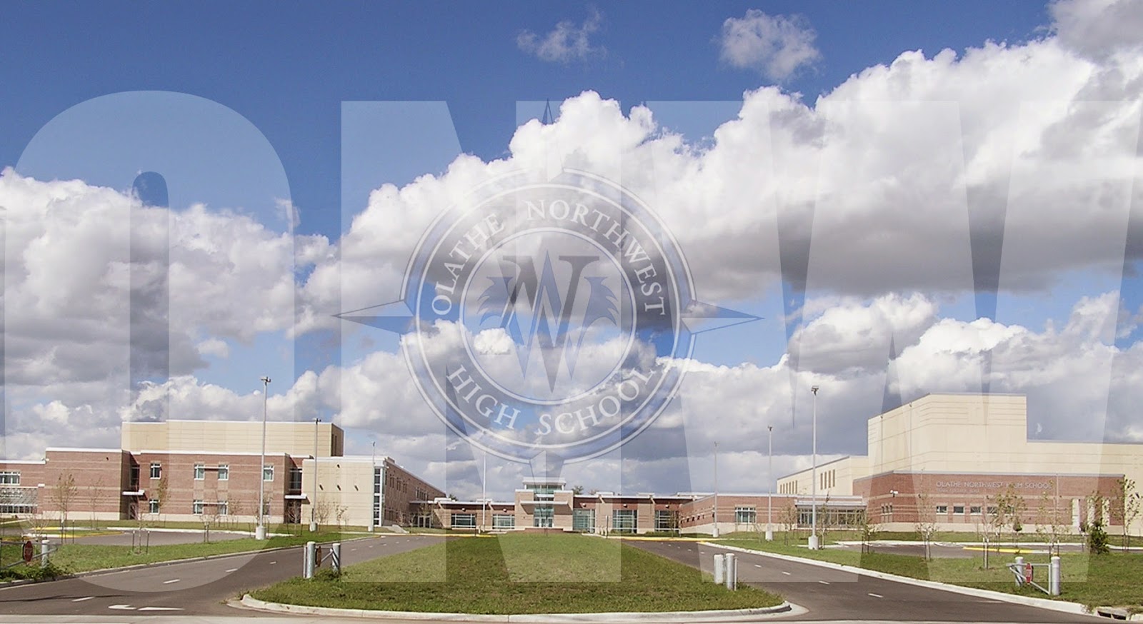
In our first photoshop project our task was to resize the compass and play around with transparency. We used the text tool to choose the font, color and size of ONW. I struggled to resize the compass but I eventually got it to the size I wanted and it turned out looking good. Next time I would make the compass more noticeable and easier to see.
 |
| Project Two |
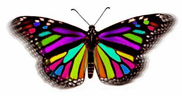
For the butterfly project the goal was to create a bright and symmetric butterfly that had the effect of fluttering it's wings. In order to make the flying effect we used the clone tool and moved it down the sides of the wings a couple times. When changing the colors of the wings we changed the hue and saturation slider. At first my biggest challenge was using the clone tool but after getting the hang of it, it was easier. I would change a couple of the colors on the wings if I ever did this project again.
 |
| Project Three |
Project three was to create the letters northwest to look like they are being cut out of the gradient with the school in the background. We used the gradient tool to create the gradient with our school colors then used a text mask to "cut out" the letters. After that, I changed the saturation to make the background have a black and white effect. The hardest part of this project was to make sure I had the gradient exactly how I wanted it to look. If I did this project again I would show more of a transition from black to blue in the gradient.
 |
| Project Four |
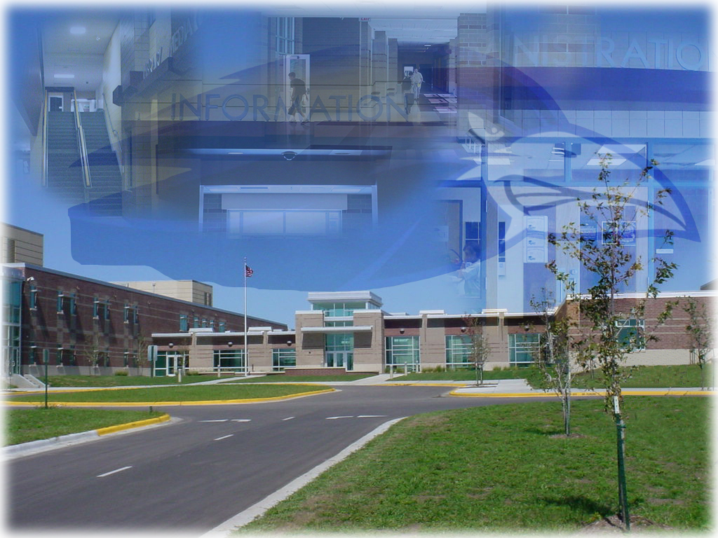
In our final project we were assigned to use the clone tool to remove two of the light poles and the cars that were showing in the picture. After that we used the lasso tool to crop the raven out of the picture of the gym and put it in the background. We then edited four pictures of around the school and copy and pasted them into the picture. I changed the effect and saturation of all the pictures then created a mask to fade out the edges of each picture. The only thing I would change would be the positions of the four pictures because they look blurred together.


No comments:
Post a Comment